Colour or Black & White?
A very common decision point that eludes many photographers is a choice between colour and black-and-white photography.
How does one make a decision about which is more powerful mode of depicting the story of the photographer?
A seemingly obvious answer is capture, look and decide. However, this seemingly obvious answer often leads to uncertain decisions. In fact, it often leads to an opinion poll taken from friends and fellow photographers.
If one understands the basic concepts of visual design of a photograph, this decision can become fairly simple and obvious.
The common elements of visual design include lines, shapes, forms, patterns, textures, colour among others. If you observe the frame carefully, we can quickly pick out the prominent and dominant elements which lead to creating impactful story. These elements also help us in deciding the impact of colour or simple tonal variations inside a photograph.
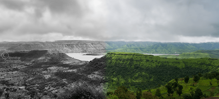
Let us take the example of a photograph on top. It is a landscape that shows plenty of shades of green as well as an interesting pattern of shapes in the clouds. One can also notice interesting lines of the exposed rock in the scene. In short, there are multiple elements of visual design that are playing roles of creating interest points. The question then arises is “which of these elements is the most powerful one?”. How does one decide?
A quick trick to get an idea of the most important or most imposing design element is to rapidly open and close eyes while looking at it. This way one can easily figure out what is the most striking feature of aspect of the photograph. (This is in case you do not remember what you felt like shooting at that time!)
In the landscape above, although the shades of green are creating interesting patterns, the more interesting and intriguing is the shadow and highlight play that is created due to the light. The rock lines are definitely not the most prominent or eye-catching feature. Tonal patterns in the clouds are interesting but then they are practically devoid of any colour. To summarise this, in this landscape although colour is definitely adding interest, it does not seem to be the top most important elements of design. This should open a possibility of having a very interesting black-and-white photograph.
In many cases, when colour is not the important feature, it actually acts as a distraction to the viewer. The message or the story is carried far more powerfully just with lines, shapes and tonal variations. These are the obvious cases in one would opt for black-and-white or monochrome imagery.
In many emotive portraits, black and white photographs become far more touching than coloured ones.
Having said this, it is of utmost importance that every photographer decides what compelled him to take a photograph. Regardless of theoretical presence or absence of certain elements of visual design, it is that one single impacting element that pushes a photographer to capture the frame, which should be the deciding factor. For example, if it is the play of colours that made you stop in your step and take a photograph, your story, as felt at heart, is about colours. And your decision would obviously be to keep a colour photograph. On the other hand, if the frame in front of your eyes motivated you because of the patterns of light and shadow, the astounding tonal variations, then your story does not have too much of relevance to colours. In this case your natural choice should be a black-and-white image.
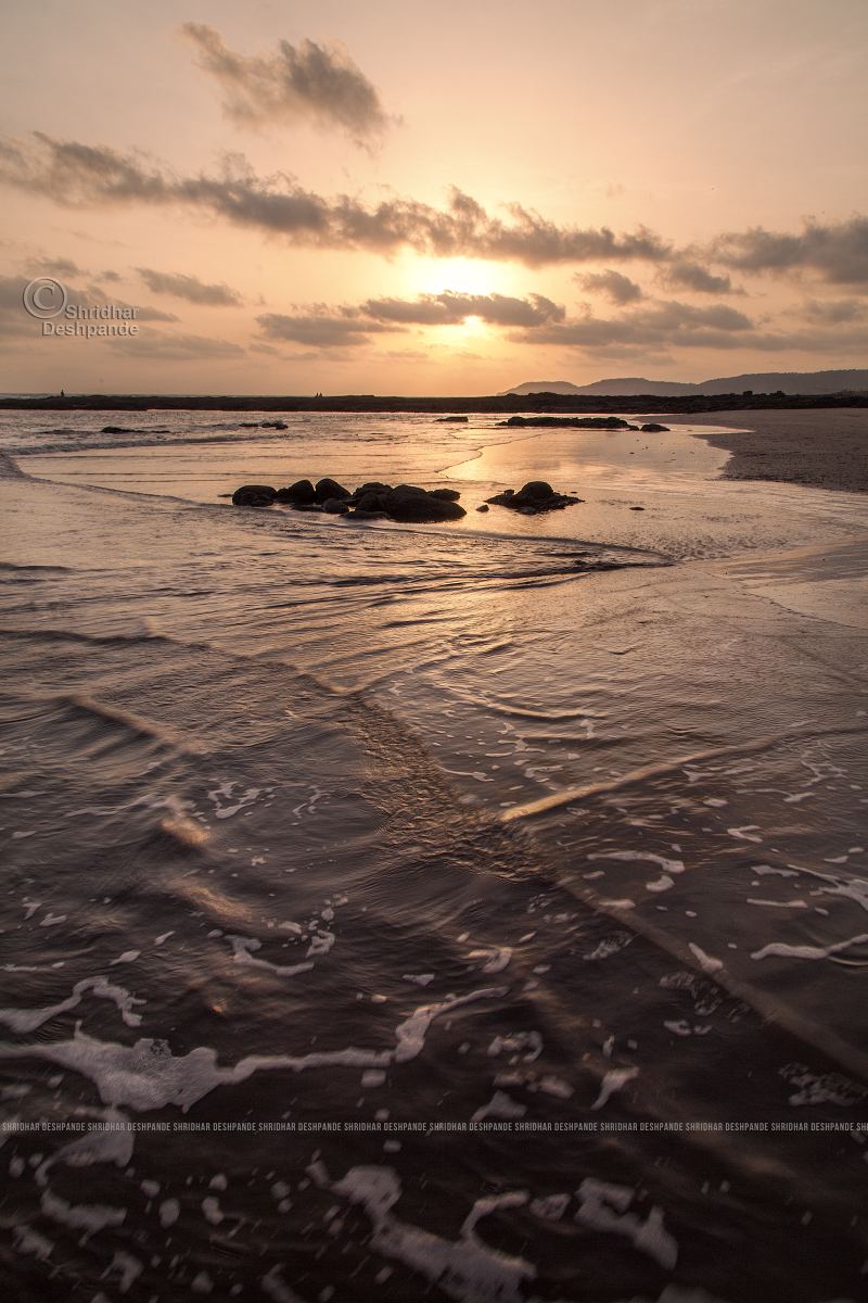
Sunset at Velas beach, Konkan.
Colours are clearly the story tellers, along with the wave patterns.
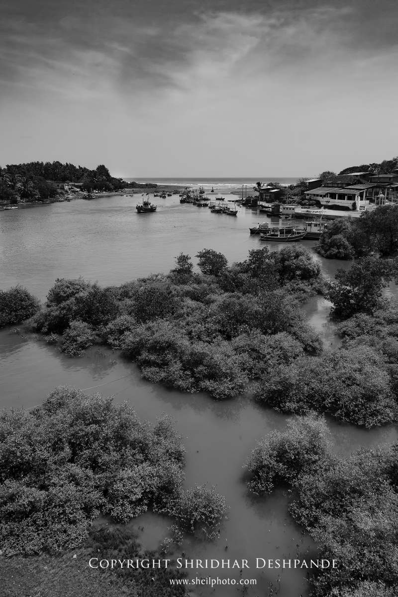
Creek near Utambar bridge.
The intense tonal patterns and subjects tell the story.
In such case, colours can also play a key role.
This is where the photographer needs to tell his/her own story!
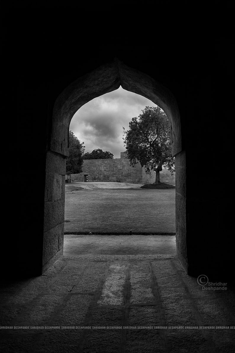
Hattikhana (elephant stable) at Hampi.
The intense contrast and tonal variations are the predominant elements.
Colours, in fact, will be a distraction.
More often than not, photographers tend to resort to a simpler decision maker.
Do correct processing in both colour and monochrome. Then look at them and decide which one they want to keep.
Well, this works too. However, the only problem in this method is your photograph is not about what you felt but it’s more about how efficient you are in different types of post-processing.
It is the heartfelt element that needs to come forth in the depiction of a photographer’s story.
This makes the decision fairly simple!
Try and get out of your photograph the beauty that you felt first…
After all, are we not telling our story as photographers?

